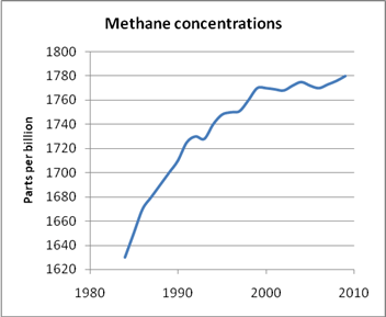
Increase in Methane concentrations in the atmosphere levelled off around the turn of the century. No one knows why. Source: NOAA.
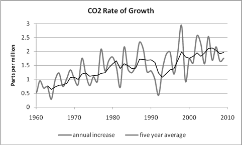
The forecasts for CO2 concentrations are better, but still short of the horror story the IPCC wants to sell. CO2 concentrations in mid-2010 are about 388 parts per million (0.0388 per cent of air), as can be seen from the second graph, which is a little ahead of the lowest IPCC projections of 381ppm. But the mid range projections are mostly above 390ppm and the highest is nearly 400ppm. Again the top-range of the panel forecast supposed, in effect, that a slight acceleration in rate of increase of CO2 levels evident in the years before 2000 would not only continue, but increase. Instead that acceleration died away, with the increase levelling off to around 2ppm a year. You can see change in the rate of annual increases in CO2 in the third graph constructed from figures on the Mauna Loa site.
Advertisement

CO2 trends moving up, but not as fast as the IPCC forecast. Source: NOAA.

Annual increase in CO2 concentrations as measured at the Mauna Loa station. The average annual change has shown only a very modest increase for more than a decade.
One answer from the panel to all this wearying criticism is to point to what amounts to a carbon dioxide hockey stick. Look how much CO2 has increased since pre-industrial times? A great deal could also be said about that assertion but the real problem is trying to forecast, accurately, what will happen rather than what scientists think has happened in the past. As we have seen, as far as methane is concerned, this is now impossible as scientists have confessed they have no idea what is going on with the gas.
As for CO2, simple arithmetic shows that an increase of 2 parts per million a year over a century is 200ppm, or a touch more than 50 per cent of present concentrations, not double. During all of this industrial emissions have undoubtedly increased, mainly thanks to China which is reportedly building more capacity than the entire Australian electricity generating network in coal fired power stations every year. But that vast increase in emissions has been occuring for many years and should be evident in the existing concentrations. So where is the supposed acceleration in the increase in concentrations?
Advertisement
Activists may also say that 2ppm per year is too much and they may be right, for all I know, but before we start talking seriously about cuts it would be nice to know just how much industry is supposed to cut, given that the existing projections are short somewhere along the line. My impression from the Copenhagen Conference is that the cuts suggested, but never agreed to, were based on the top range IPCC forecasts.
But then the IPCC has not helped matters by entirely ignoring the problem. They have made no attempt to communicate the good news of the methane concentrations, and do not seem to have made any plan to issue revised projections. The panel seems quite happy with the projections the way they are. The real question is, then, what projections are the busy climate modelling community using for their all-important climate models?
Never short of an argument activists may respond that the present rate of increase can still accelerate, to put CO2 concentrations back up near the top end (this would require major changes). In any case what should one drop of real world data count against several bucketfuls of computer simulation done by highly-qualified people? Perhaps, although given the success rate of the computer modelers to date it would seem just as likely that the rate of increase may slow down or even go backwards. But with the science of global warming settled and certain, how could that happen?
Discuss in our Forums
See what other readers are saying about this article!
Click here to read & post comments.
51 posts so far.