Every few years I get the chance to set a batch of poetry by hand to print using letterpress. It’s a different thing to my usual piecework setting individual lines for titles or colophons. It’s also a completely different thing to typing anything on a computer.
Have you ever stopped to think how many words we can write daily without effort? With computers, word production is almost inexhaustible. Churn out the letters, wipe them out if they’re not working, print them out as many times as you like.
Old-fashioned letterpress (as opposed to linotype or monotype) is set letter by letter, side by side, line by line. It is a slower process than handwriting, but they are closely connected in relation to keyboarding.
Advertisement
The personal effort made when writing legibly by hand closely connects the writer to the page, to the words, to the intention behind the words. The process is slow enough to allow the writer to consider very carefully the next word, the next line. I don’t think computer keyboarding allows this to the same extent, although as I’m not a professional writer I’m not really qualified to make such a generalisation. But look at how much superfluous text is being generated out there, if only in blogosphere!
When I set a poem by hand, I think about these things. I can’t think with too much absorption, otherwise I will set the wrong word. It’s a bit like driving a car across the Nullabor plain: you can see a truck coming for hours, but if you don’t concentrate, you’ll still hit the bugger head-on when it finally comes close, even though there’s nothing else around for kilometres. You can know the line of text you’re setting off by heart, but if your mind wanders, typos creep in. But … the mind always seems to wander.
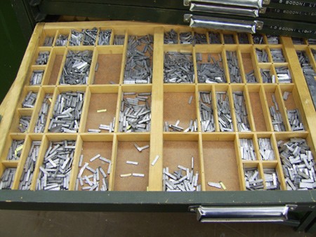
In Australia, we have very few letterpress resources. There are no foundries anymore, casting fresh metal letters (or none that I know of, please tell me if you know of any); if you’re keen enough, you can have fresh type shipped over from the US or the UK, but they sell it by weight, and it’s heavy stuff. Consequently a lot of what is here is quite worn.
To set my book of poems (I’m working on a selection by Nan McDonald), I am using what was, when I started, a reasonably full case of Bodoni 12pt roman. Enough to print 14 poems, but only if I set four pages at once, then pull them apart and set the next four pages. My first page printed was a shock. This is a case of type that has been used by students and staff in an arts institution for many years, and at a technical college for years before that. Consequently many of the letters are very worn (giving them a “thick” look when inked) or chipped.
I started to make a box of this worn type as I substituted it for letters in better shape, and keeping it separate as I dissed the type back into the tray. I’m now almost halfway through the printing of the book’s text, and each page looks better at the first pull.
Advertisement
Some letters wear faster than others. Anything with a serif on an ascender or descender is in danger: b, d, k, l, p, y. Pointy letters: w, m. Dotty letters: i, j. And the letter r is becoming particularly scarce. Some letters get recycled so often that they become friends. I have a particularly sharp r that I put aside as I diss to use in prominent words in each poem. And yet I have an overflowing compartment of the letter c, most of them new. The problem is, I can’t use the new ones because they look strange next to all the worn letters. Luckily the thickness of the paper I’m using (280gsm) allows the different height of the worn type to be accommodated. I’m letting it bite ever so slightly into the paper, without “show through” on the other side.
I don’t want my pages to be perfect. I’m happy with the slightly uneven look I’m achieving; otherwise I might as well just print this book from an inkjet printer. However, when I say “prominent” words I mean that. As you read a poem, there are times when a words leaps out at you, and in this case it’s for all the wrong reasons. You want the type to be invisible in a way, to let the meaning of the words exist independently. If a word is leaping out at you because it’s thick, dull and broken, it’s unfair to the reader.
But the warmth of a handprinted page is delightful, ranging from dark greys to a dense black. It’s a small challenge for the spoilt eyes of a modern reader, to whom variety in print quality means the ink heads are a bit clogged, something to be fixed.
It is the finite (and rapidly dwindling) number of letters that made me think about the preciousness of words set or written by hand. Poets are, by their nature, careful with words. It is a marvellous experience to get so intimate with a piece of writing. You may think your eyes and your mind caress a word as you read it, but imagine holding that word, piece by piece, and thinking about all its layers and nuances as you ease it into place (albeit upside down and back to front!).
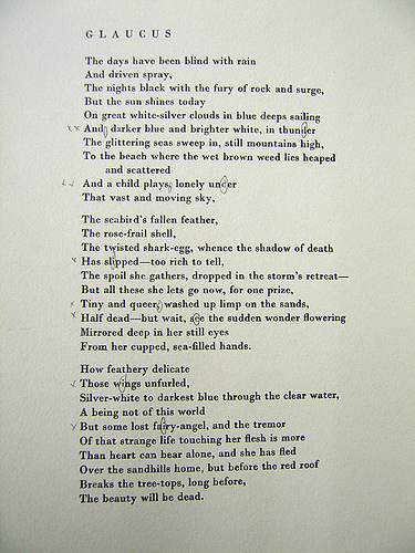
Poets are also fond of alliteration, and patterns within their text. This time bend your brain to the frustration of knowing that you’re about to run out of “r”s and “k”s and meeting this line:
Dark its death-shining where the rocks rise black,
Gah! That’s when I take my tweezers and pull a few letters out of another set poem, hoping to hell that I don’t damage the top of the type with the tweezers as I ease it out.
And then I start setting again, and invariably my mind wanders. These are some of the things I’ve found myself thinking:
Many people think that newspaper compositors in small country towns over the last couple of centuries would have been rough working men. In fact, they were probably the most educated men in the region. They had to be able to spell, set, edit and proof, and print. They were the hub of the community. I’ve been enjoying dipping into Elizabeth Morrison’s Engines of Influence over the past couple of years and finding out things like this.
This issue of type running out as you’re setting it probably forced a number of changes to text that writers hadn’t wanted. I’d say there are numerous cases of sly compositors substituting words for others that had more readily available letters in them, especially for newspapers and cheap novels. These days we edit for style, and for economic factors (i.e. reducing the number of pages or a column length) but before automated typesetting I’m sure a lot of changes were made at the grass-roots level (the kinds of changes sub-editors can do these days out of ignorance! ;))
Someone commented to me the other day that the colonial notion of relying on a “mother country” like we used to with the UK has sort of come full circle with letterpress and other outdated technologies.
When Australia was first established, we had to drag printing presses across the world, along with type and everything else, and getting replacement bits was time consuming and expensive. (Did you know that the First Fleet contained a printing press, but no one who knew how to use it, so it sat around Port Jackson for about 20 years?)
Then we caught up with technology, and were pretty self-contained. Then we fell behind, because all the fancy new offset stuff was progressing in the US and Europe. So Australians ditched all the old things and fully embraced the new; we are now forerunners in cutting-edge print technology. This is bad news for anyone wanting to resurrect the old stuff (like me, and anyone into photo-etching), because as a nation we’ve chucked it all, or melted it down into scrap, or turned it into wall plaques. Gah!
Imagine being the compositor for Gertrude Stein’s books! Or James Joyce! All set by hand! eek! If anyone made a mistake, who would notice! Did the authors notice? Or do you think they would have been delighted with the accidental shift in their phrasing?
Leonard Woolf thought setting and dissing type would be good for Virginia’s nerves, which is one of the reasons why they started a press. It probably was, for a while, but I noticed when reading both of their biographies that after about five years they contracted out the setting to a professional compositor, then printed the set text themselves. Wise man, that Woolf.
I’m obviously playing the right music, all the students have taken their iPod earplugs out to listen.
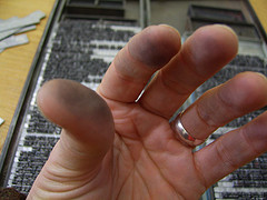
Gee this type makes my fingers dirty.
Ahem. Of course, once set, the text can be printed out numerous times, thus making it more accessible than handwritten text, but not as quickly as computer printed text. And digital printing is faster again. But that’s the history of typesetting in a nutshell, isn’t it? And somehow the slowness of the production, the time taken to make this text appear, is something that works for me. I get to ingest the words, letter by letter. It brings the poems to life.
Whether it does so for the reader at the other end is another story altogether.

 reddit this
 Seed Newsvine
 StumbleUpon