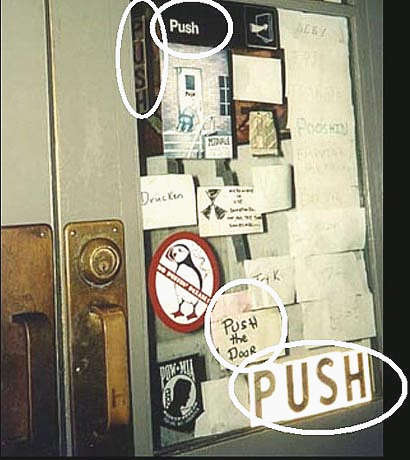
How many times have you pulled a door, and then realised you should have pushed?
If you're like most people, probably quite often. You might even find yourself thinking what a dumb mistake you just made.
Actually though, it's not your fault: if the door is supposed to be pushed, there shouldn't be a handle at all. That's because a handle's message is: "pull me".
Advertisement
Instructions don't work
The example below is a hilarious attempt to fix a bad design with an ever-increasing number of instructions.

This door's handle should be removed, and then there would be no need for instructions. People would just automatically get it right.
Since most people don't read instructions, good designs don't rely on them to make people do the right thing.
Unfortunately, people pay far too much attention to developing technologically clever designs and not enough to the humanity of the people who will use them. This is especially true of information technology products.
Disastrous results of the 'dumb mistake effect'
When a piece of technology isn't designed for the human who ends up using it, the results can range from lost revenue to loss of life.
- USA elections in 2000: Supervisor of Elections Theresa LePore, who designed the notorious Florida ballot paper, had good intentions. She wanted to make the print easier to read for older people by making the font size bigger (there are a lot of older people in Palm Beach County).
Advertisement
But she couldn't fit all ten presidential candidates on one page in the bigger size, so the names were put on facing pages, making it unclear which vote related to which candidate.
This error arguably cost the Democrats the election.
- London Ambulance Service dispatch system: this came into operation in 1992 and was shut down almost immediately. The design didn't take into account the people who operated it: the designers had changed the physical layout, making it harder for people to exchange information or cooperate with each other; and it was easy to miss important information scrolling off the screen, among other things.
Discuss in our Forums
See what other readers are saying about this article!
Click here to read & post comments.