How many times have you pulled a door, and then realised you should have pushed?
If you're like most people, probably quite often. You might even find yourself thinking what a dumb mistake you just made.
Actually though, it's not your fault: if the door is supposed to be pushed, there shouldn't be a handle at all. That's because a handle's message is: "pull me".
Advertisement
Instructions don't work
The example below is a hilarious attempt to fix a bad design with an ever-increasing number of instructions.
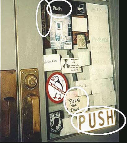
This door's handle should be removed, and then there would be no need for instructions. People would just automatically get it right.
Since most people don't read instructions, good designs don't rely on them to make people do the right thing.
Unfortunately, people pay far too much attention to developing technologically clever designs and not enough to the humanity of the people who will use them. This is especially true of information technology products.
Disastrous results of the 'dumb mistake effect'
When a piece of technology isn't designed for the human who ends up using it, the results can range from lost revenue to loss of life.
- USA elections in 2000: Supervisor of Elections Theresa LePore, who designed the notorious Florida ballot paper, had good intentions. She wanted to make the print easier to read for older people by making the font size bigger (there are a lot of older people in Palm Beach County).
Advertisement
But she couldn't fit all ten presidential candidates on one page in the bigger size, so the names were put on facing pages, making it unclear which vote related to which candidate.
This error arguably cost the Democrats the election.
- London Ambulance Service dispatch system: this came into operation in 1992 and was shut down almost immediately. The design didn't take into account the people who operated it: the designers had changed the physical layout, making it harder for people to exchange information or cooperate with each other; and it was easy to miss important information scrolling off the screen, among other things.
While the design was technically perfect - it did what it was designed to do - it resulted in about 20 unnecessary deaths in just three days.
- Atlanta Olympics bomb threat: a call was made to 911, "there's a bomb in Centennial Park, you have 30 minutes". Dispatchers couldn't find Centennial Park's Street address in the system, and couldn't add the call to the dispatch roster until it was entered correctly.
It took a vital 10 minutes to find it - eventually they called someone who knew the phone number, then rang the number and asked for the address. By the time they were able to alert the police, the bomb went off, killing one person and injuring dozens.
- Mission-critical piece of software: 80 per cent of staff in a large company client of ours used this system. It took 9 months to learn, but the staff using it worked there for an average of just 12 months.
It took six minutes for experienced users to do the most common task (which our new design whittled down to about one minute). When measured across all the staff over a year, this task alone amounted to millions of dollars in lost productivity.
Why do people design this way?
In an environment of imminent deadlines, financial pressures and creative flair, the focus naturally seems to fall on the technology or the product's functionality, rather than how humans will use it.
Some projects don't even have a designer and the most junior programmer ends up flinging an interface together in a couple of hours.
But usually it's because the people on the technical and design teams aren't typical of the people who'll use the system; they know things users don't know and see the system in an utterly different way.
Take the Florida ballot. The designers of the ballot needed to design a space for all ten candidates plus one extra slot for a "write-in" candidate. They saw it as a table of two columns with a bunch of rows in each column, with a line of buttons between them.
But the voters weren't looking at it from that point of view. They just wanted to vote for one candidate. This difference in outlook is vital - it makes or breaks a design.
The picture below shows how the actual ballot looks when attached to the voting machine, as seen from the perspective of a medium-height voter.

Say I'm a voter in that election, and I want to vote for Gore. The natural thing to do is to scan down the first column until I spot his name. "Ah", I'd think, "he's the second one in the list, so I'll press the second button". And that's where I'd stop looking, because I've found what I want. I'd tend to ignore the arrow, because I've found what I want and, like most people, I don't read instructions.
There's no reason for the voter to look at the other column at all, let alone analyse whether they've picked the right button or not. They just assume that they have.
And I'm not making this up, after all - 23,000 people did something a lot like this.
Unfortunately, the design team (and others connected with the project) can't put themselves in the users' shoes. It's not possible to take away your pre-existing knowledge and see things the way a newcomer would.
How do you avoid the dumb-mistake effect?
Designing in a user-friendly way requires a commitment to working out what tasks users are trying to do while they're using the device or system.
To find out what these are, you need to understand the context of the person using it and what they're trying to achieve.
You also need to know not just the immediate task but also the wider task it's part of (eg, not just "choose from 11 boxes", but instead, "vote correctly for a particular candidate"). This lets you understand all the different requirements that users might not even be able to articulate. Now you can design and test for whether users can achieve that wider task.
You also need to consider the context that they'll be using the system in, for example:
- a voting booth (where a medium-height person might not be looking directly down on the page, but at a slight angle, changing the apparent position of the holes);
- or a web site, where your customer service people can't point and say - "the rates are here, ma'am".
What does a good design do?
In short, a good design:
- lets people using the system easily achieve the task they're trying to perform (eg dispatch a police unit, vote, apply for a home loan, etc)
- achieves what the system's owners want it to (eg respond quickly to emergencies, run an election, make money, etc)
- works how the user thinks it should work (not necessarily the most technically perfect, but perfect for the user)
- lets people focus on doing whatever they're doing, without needing to think about the technology or tool itself
- is easy to learn and remember
- is quick to use
- makes it hard for people to make "dumb mistakes".
How do you get "newcomer" input?
It's simple: ask them. The best way to get a good design is to involve "newcomer" users in the design process.
A lot of design teams try to do this but in ways that aren't effective. They:
- develop user requirements documents: these are a good starting point, but they usually don't consider the wider context. Often they are developed by people who think they know what users will need, without considering hard data about user's tasks and context of use. ("They're our customers, I know what they want")
- invite users onto the project teams: these users quickly get caught up in the project team's perspective and lose their "newcomer" point of view
- run focus groups and surveys: people don't always act the way they say they do. Sometimes they'll say what they think you want to hear, to please you and avoid giving offence. Other times they don't notice what's happening or they don't remember all the steps they took.
Watch people and ask questions
It's often more productive to take more notice of what people do than what they say they do. For that you need to watch people using your designs doing real tasks.
To achieve this, we use a process called "user-centred design". We show high-level paper versions of designs to typical users (not people on the design or technical team) in design sessions.
We give them real life tasks to do in a realistic context. ("It's the election. You want to vote for Al Gore, your kids are in the car outside, you have dinner on, and it's freezing in the voting booth.")
Then we watch what they do and ask questions. This uncovers most problems. Then we refine the designs and add more detail, then go back again to discover any other flaws. Finally, we do individual sessions to follow people through a full task, to make certain it's working the way they want it to.
We do all of this before anyone writes a line of code. That's because it's way cheaper to get designs right on paper than it is to rewrite code - about 10 per cent of the cost of changing it at the "prototype testing" phase, and a tiny 1 per cent of the cost of doing it after the system is released.
Get real users involved during the design process and it's much easier to help humans avoid making dumb mistakes with clever products.

 reddit this
 Seed Newsvine
 StumbleUpon