For those interested in the Australian residential property market, below are a collection of figures illustrating long-term trends. Housing prices and land values are compared to a basket of fundamental metrics. Australians are fortunate because much data on real estate and financial markets are publically available, going into depth not seen in other countries.
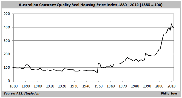
Comparing housing prices to inflation is one of the more common indicators in property market analysis. If the trend is fairly even over time, then there is no indication that people are favouring housing relative to other goods and services. On the other hand, if there is a wide divergence between housing prices and inflation, this tells us that people are considering housing to be relatively more important. Interestingly, every rise in real prices has led to a downturn, with the one exception of 1961-1964.
Advertisement
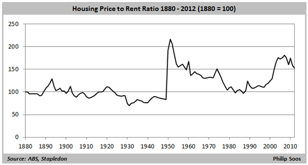
Another popular method of determining property valuation is comparing housing prices to rents. In a fairly efficient market, the costs of buying and renting should closely match each other, though due to factors such as taxes, risks, and interest rates, it is unlikely that costs will equal. Since the post-WW2 boom, the ratio has unevenly decreased. Upswings in the ratio suggest the presence of a bubble: the mid-70s, early 80s, late 80s, and today.
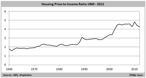
As with inflation and rents, housing prices have also outstripped incomes as well. Unfortunately, the ABS does not provide a long-term median household disposable income (HDI) series, so the denominator is derived by dividing aggregate real gross household income by the number of occupied households on an annual basis. This results in an unusually high HDI as averages are typically greater than medians, and is further amplified as the HDI is stacked with artefacts like superannuation which cannot be drawn upon to finance debt repayments. While the outcome is a rather low ratio, it keeps in line with that developed in Stapledon’s 2012 housing paper and shows a substantial increase from 1996 onwards. A more realistic median measure would result in a higher ratio, and the latest Demographia report shows it to be so.
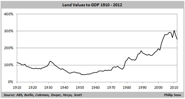
It is easy to see the major cause of the Great Depression: a deflating land bubble, centred in the commercial property market. Every major rise in the ratio has resulted in a downturn, correlating with, and arguably, causing the economic recessions of the mid-70s, early 80s, and early 90s. The ratio has doubled from the trough in 1996 through to the peak in 2010. The substantial rise in the ratio during the late 1970s was likely due to an anomaly in splicing multiple land value series together, though part of the rise is justifiable because of a residential bubble.
Advertisement
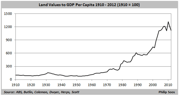
The same story emerges when land values are compared with GDP per capita, which is arguably a better fundamental metric than GDP itself. As with the previous figure, the ratio has doubled during the same time period.
Discuss in our Forums
See what other readers are saying about this article!
Click here to read & post comments.
4 posts so far.